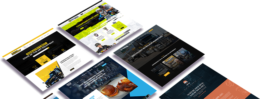
Let’s take the lessons learned from the examples in our previous article Unveiling the Secrets of Masterful User Experience Design: Insights from Carnival Cruise, Disney World, and Cirque du Soleil, and apply them to interaction design scenarios for websites and mobile apps:
User-Centered Design
In website and mobile app design, user-centered design remains paramount. Conduct thorough user research to understand your target audience, their goals, and pain points. Utilize techniques such as user interviews, surveys, and usability testing to gain insights into user preferences and behavior. Tailor the design and content of your website or app to meet the specific needs of your users, ensuring personalized and relevant experiences.
For example, a travel booking website could offer personalized recommendations based on a user’s travel history, preferences, and interests. By providing customized suggestions for destinations, accommodations, and activities, the website enhances the user experience and increases engagement.
Clear and Intuitive Navigation
In the digital realm, clear and intuitive navigation is crucial for users to find information or perform desired actions effortlessly. Design websites and mobile apps with well-organized menus, intuitive icons, and logical information architecture. Utilize breadcrumbs, search bars, and filters to help users navigate through content efficiently.
For instance, an e-commerce app could employ a straightforward and categorized navigation menu, allowing users to quickly find and purchase products. Implementing a search bar with auto-suggestions and filters by price, brand, or category further enhances the navigation experience.
Visual Hierarchy and Immersive Storytelling
Apply visual hierarchy principles to guide users’ attention and create engaging experiences. Utilize typography, color, and contrast to emphasize important elements and create a sense of flow. Craft immersive storytelling through compelling visuals and narratives that evoke emotions and capture users’ interest.
For a storytelling app, use visual cues such as larger fonts, contrasting colors, and strategically placed imagery to highlight key moments or content within a story. Enhance the immersive experience with interactive elements like parallax scrolling, animations, and sound effects that bring the story to life.
Consistency and Immersion
Ensure consistency across all screens and interactions within your website or mobile app. Maintain consistent branding elements such as logos, colors, and typography to build familiarity and reinforce your brand identity. Implement consistent interaction patterns and terminology to create a seamless and intuitive user experience.
For a mobile banking app, maintain a consistent layout and design language across different screens, ensuring that users feel at ease navigating various banking features. Utilize recognizable icons and standardized terminology to provide a familiar experience aligned with industry conventions.
Conclusion
Applying the lessons learned from examples such as Carnival Cruise, Disney World, and Cirque du Soleil, interaction design for websites and mobile apps can greatly benefit any brand in any industry. By adopting a user-centered approach, implementing clear and intuitive navigation, utilizing visual hierarchy and immersive storytelling, and maintaining consistency and immersion, designers can create exceptional digital experiences. Whether it’s a travel website, e-commerce app, storytelling platform, or banking application, incorporating these principles will enhance user satisfaction, engagement, and overall success.
Get Started


